Sterile Human-Machine Interfaces
A subject near and dear to a friend of mine, and recently, something that has touched my life as well.
Austin, a former classmate, approached me recently, as a graduate student pursuing a Master of Science, User Experience and Interaction degree at Thomas Jefferson University, for design help with his thesis. The first time he mentioned the phrase "Sterile Human-Machine Interfaces" I probably made the same expression you made reading the title of this post.
Here are some snippets from his thesis in an attempt to quickly explain...
"According to the Centers for Disease Control and Prevention (CDC) and other health organizations around the world, a center line-associated bloodstream infection (CLABSI) is one of four healthcare-associated infections (HAI). A CLABSI occurs when a patient has a central line that leads to the patient getting a bloodstream infection (BSI). A central line or a central venous catheter (CVC) is a tube that gets inserted into a large vein, either in the patient’s neck, chest or groin (“Healthcare-associated Infections,” 2010). "
"The reasons why a patient develops a CLABSI can range from poor hand hygiene to less than adequate insertion conditions, i.e., life or death situations in the emergency room."
"Out of the four HAIs, CLABSI is preventable, which can lead to a decline in hospital cost and the number of patients and families affected. Approximately 80,000 CLABSIs occur in ICUs across the United States every year (“Preventing Central Line-Associated Bloodstream Infections,” 2012)."
~Abstract... "The purpose of this research is to explore how incorporating hand gesture technology with a medical device can reduce the spread of dangerous microorganisms from hospital staff to patients who have a central line catheter. Lessing this form of contamination will allow healthcare professionals to comply with the aseptic technique’s sterile-to-sterile contact rule and result in a decline in the number of patients who get a central line-associated bloodstream infection. In the healthcare market, hand gesture technology is mainly used in operating rooms but at a research level."
And most importantly, the goal of this project... "Through this research, an understanding of the users and their goals will come to light. Aside from meeting this objective, it is also important to consider how the use of sterile human-machine interfaces will work in a doctor-patient environment to aid in reducing central line-associated bloodstream infections and provide an overall better quality of life for the patient."
Modern medicine meets User Experience and Design. He spent about 6 months researching, volunteering at hospitals, speaking with medical professionals, thinking through hand signs, machinery, and much more. So where did I come in?
Knowing my love of identity/branding, he gave me the background and asked me to design (in a span of 3 weeks) a moodboard, a logo, a brand style guide, and an application icon, with time for critiques on all design.
Moods

There are obvious incorporations here, but what I really wanted to peg was the feeling of approachability. There is a natural juxtaposition of sterility and approachability that had to be dulled down—I needed to find common ground. I returned to line drawings and medical illustrations. Adding some orange to some blue and green hue's pushed through the hygienic look, to something a bit more welcoming.
Sketch is best! At least, it's the way most professional designers begin a logo design. It allows us to get the not-so-great ideas out quickly, but more importantly, it allows us to work through the standard ideas (the ones the everyone immediately thinks of) to find something more unique.

Leads to...

Top Sketches // Digital Sketches

Final Mark // Logo // Application Icon
Now, let me back track a bit. Here is the logo description I wrote for the style guide...
"Our logo design begins with a san serif “G,” from an aerial view, taking the form of a person using their arms and hands to gesture. The surrounding circles represent the movement involved. Again, the importance of the user is displayed—we’ve put them in our mark!"
The large circle is a head, the rest of the "G" symbolizes the arms and hand gesture going in, toward the chest. When I started sketching and looking at the decorative "G" above, I noticed the rounded serifs could resemble hands and took off from there.
It's so important to me, if possible, to have a conceptual connection between the company, product, idea my logos represent and the design. It turns a visual into a moment because there's thought involved.
Feel free to take a look through the accompanying style guide here.
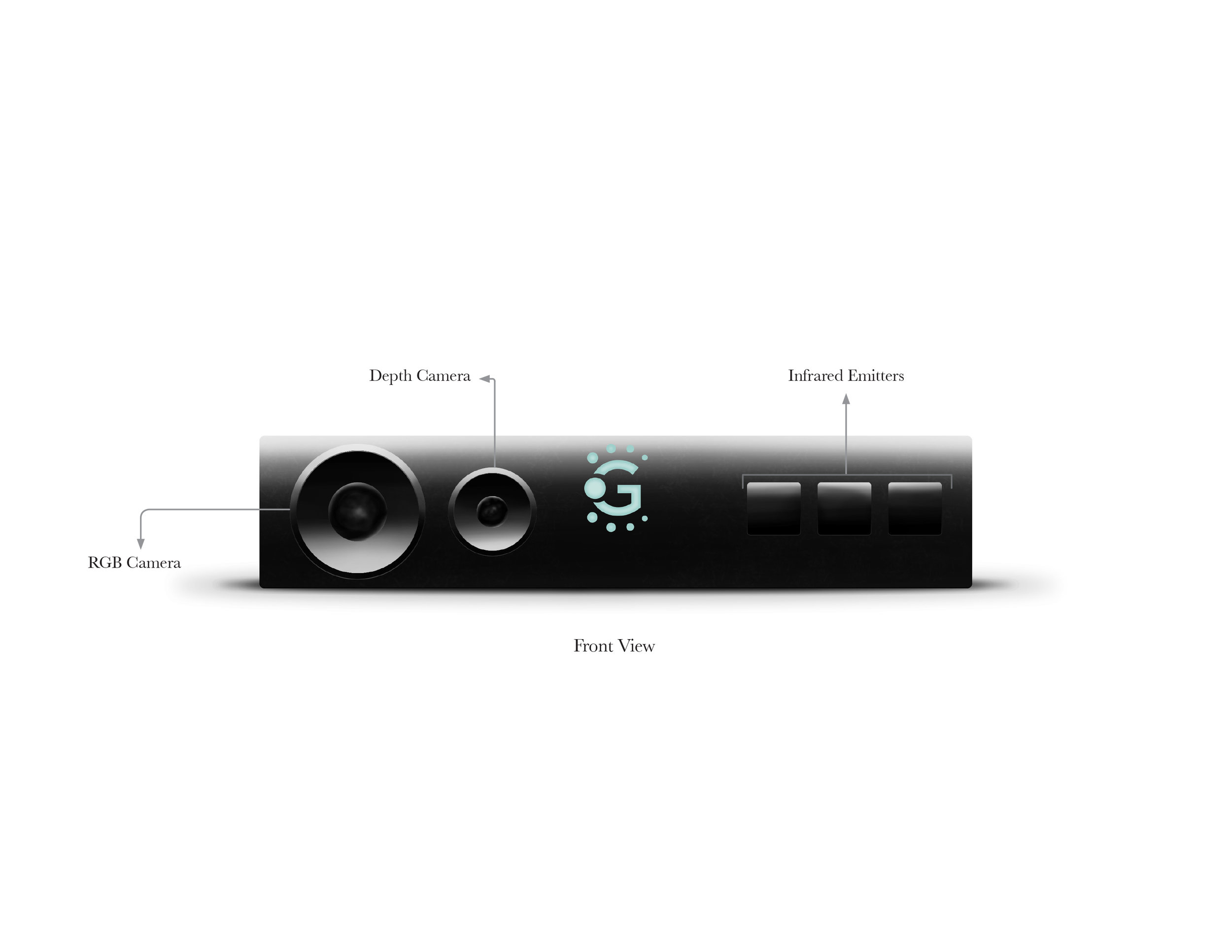
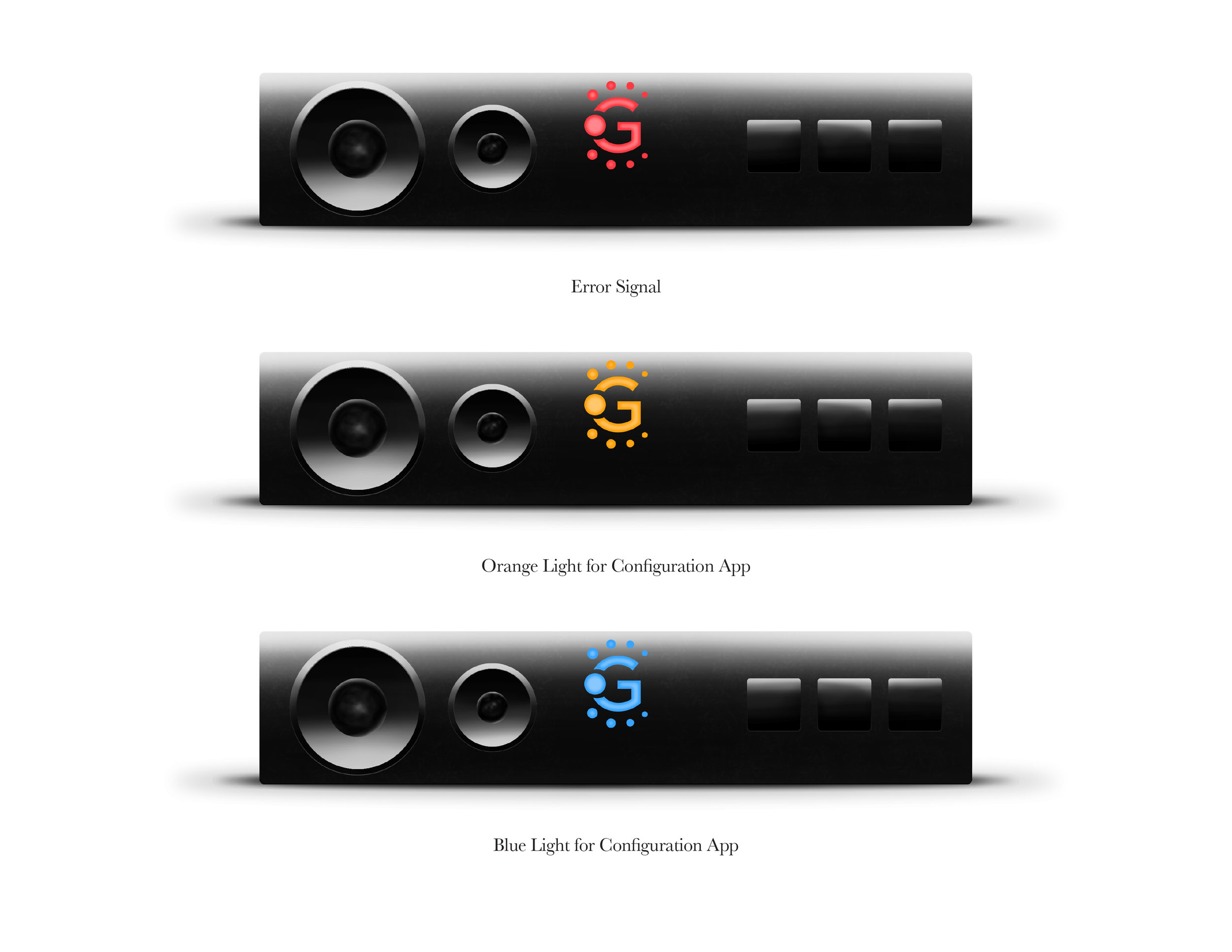
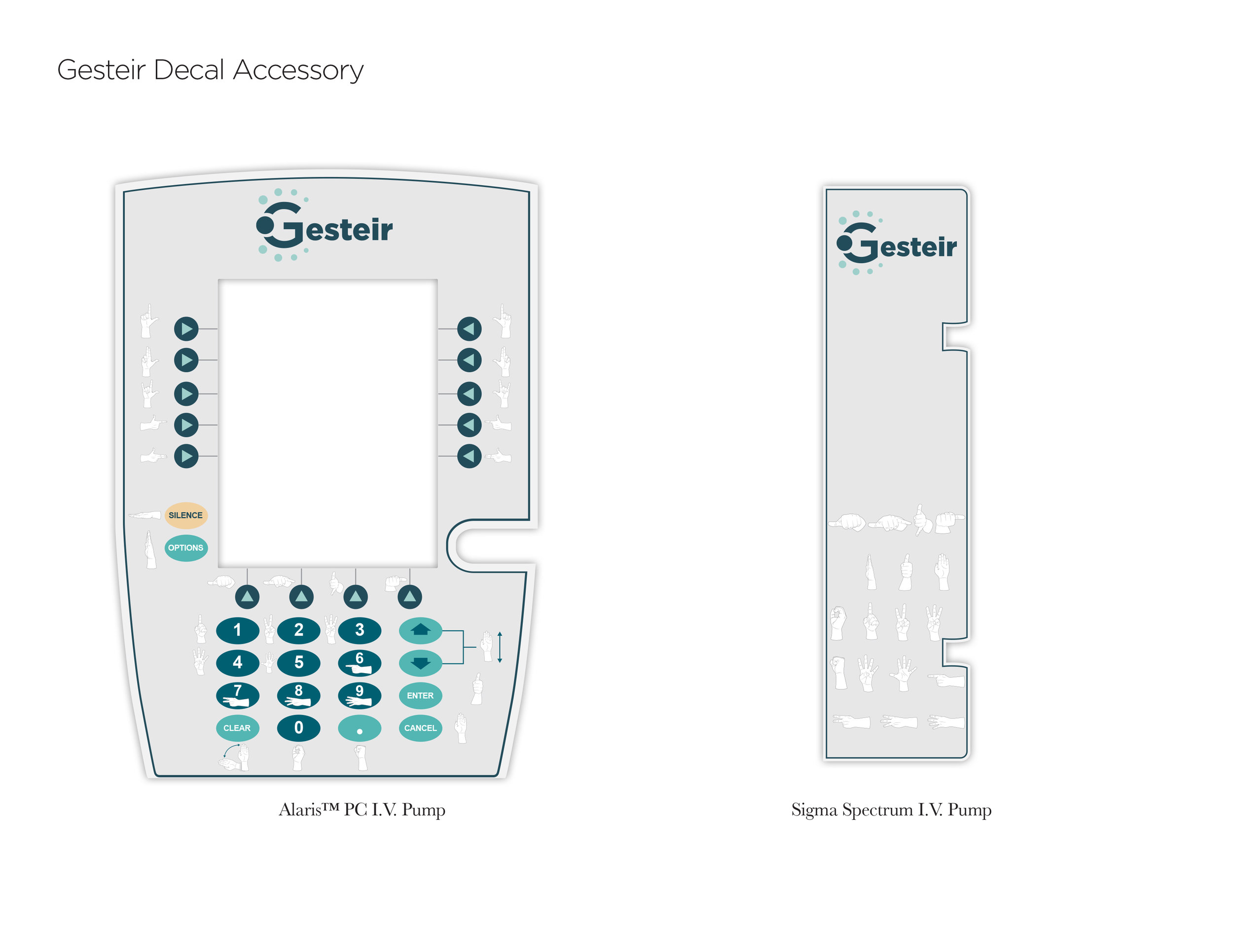
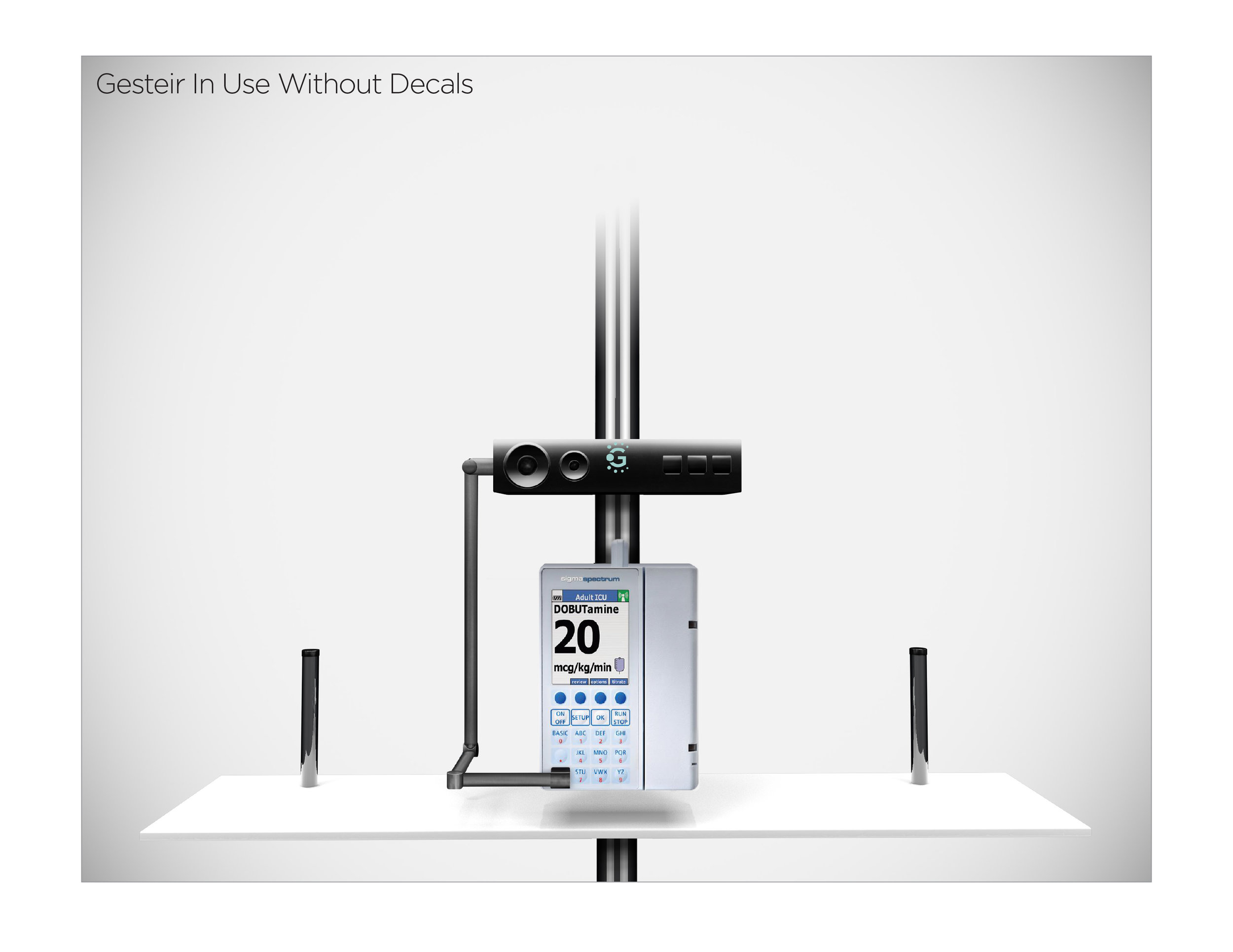
Below are a few concept designs that he created using the logo. We went back and forth a few times about the usage while I was designing it. Please click through.
This was a challenging project to be sure but that's part of why I love what I do!
✔ Branding
✔ Re-branding
✔ Brand Analysis/Insight